State Farm Customer Acquisition Enhancements
Improving the insurance checkout experience for both customers and agents through heuristic-driven design enhancements.
Problem & context
§ 01
Problem statement & context.
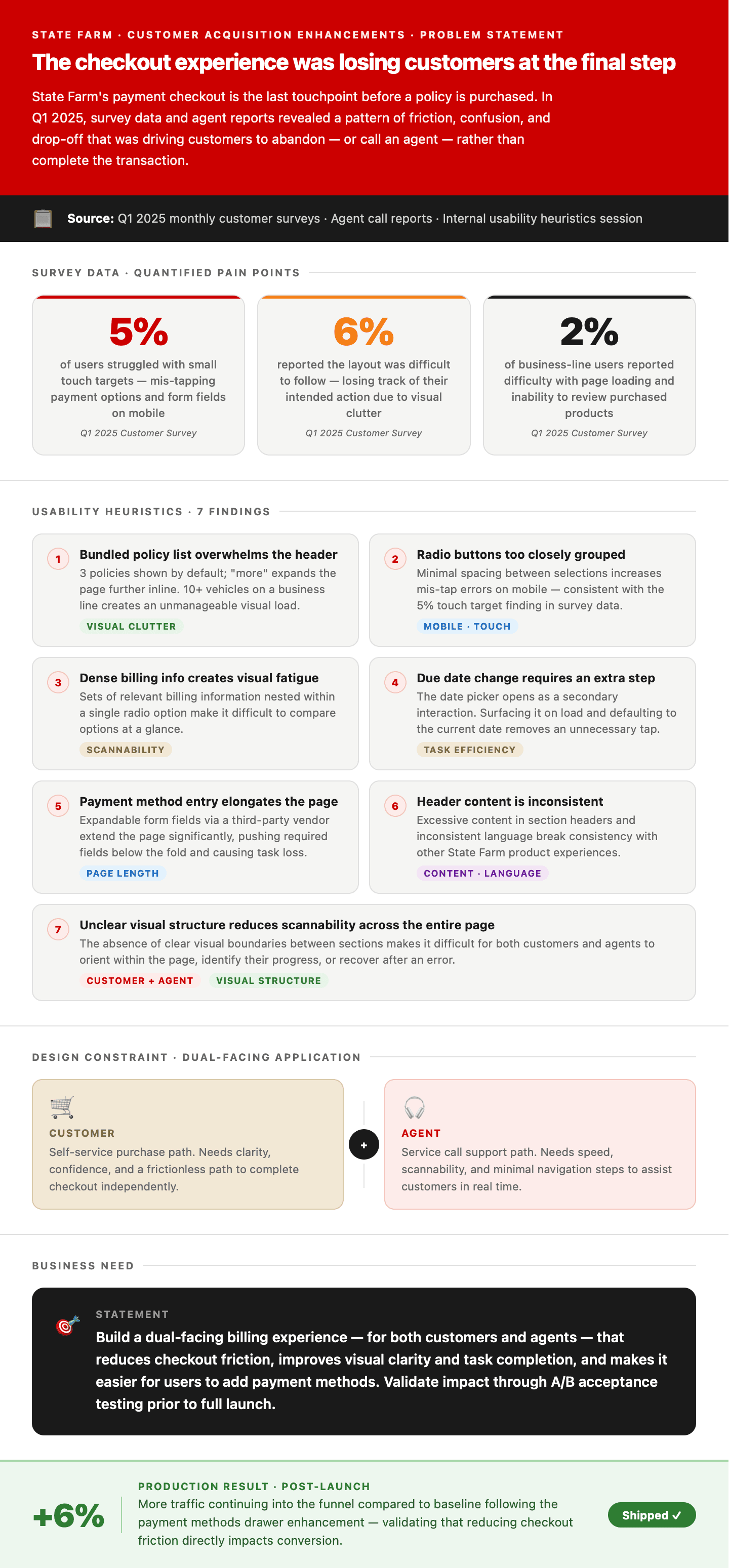
State Farm's checkout experience is the final touchpoint in a self-service shopping funnel for purchasing new policies. In Q1 2025, monthly surveys and agent reports increased call volume tied directly to customers' inability to complete payments without assistance.
The product team submitted a work intake to proactively evaluate MVP-level enhancements ahead of a broader platform redesign planned for Q4 2026. The scope was to identify high-impact, low-effort improvements that could ship within a tighter timeline — reducing friction in the existing experience without waiting for a full rebuild.
Business need & key constraint
Build a dual-facing billing experience — serving both customers and agents — that reduces friction, improves clarity and task completion, and makes it easier for users to add payment methods. The checkout application serves two fundamentally different user types simultaneously — policy holders completing a self-service purchase, and agents guiding customers through the same flow during service interactions. Design decisions had to be applicable for both, avoiding agent-level task complexity and language.
Survey data — Q1 2025
- Internal surveys indicated 5% of users struggled with small touch targets, related to often mis-tapping when selecting payment options or form fields.
- 6% reported the layout being difficult to follow and losing track of was their intended actions related visual clutter.
- Important context was buried in dense, text-heavy content.
- To add payment details, users clicked on expandable input fields through a third-party vendor, elongating the page.
- 2% of business-line users reported difficulty in page loading and not being able to review products.
Alignment
§ 02
Alignment.
I led the customer-experience workstream in partnership with two design leads, content, and an agent-experience designer.
Usability heuristics session
Before exploring solutions, our experience team conducted a structured usability heuristics review of the current-state checkout. This grounded the work in a shared diagnostic of current-state problems rather than assumption-driven redesign.
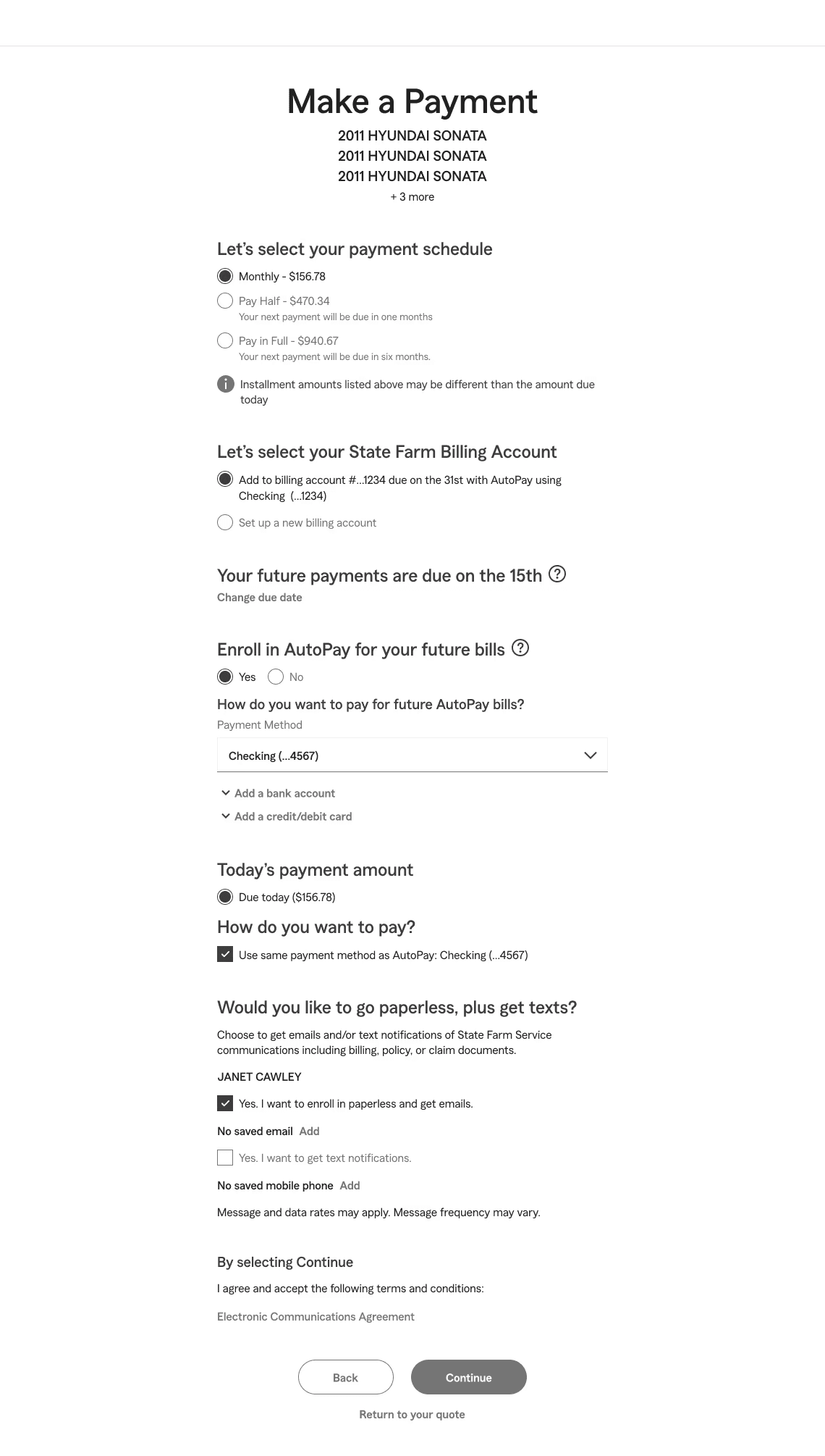
Seven findings were identified
- 01
Bundled policy display
Multiple policies are stacked as individual line items in the header. Three are shown by default; "more" expands the list inline, compounding page length. Edge cases with 10+ bundled vehicles on a business line create an unmanageable visual load.
Visual clutter - 02
Touch target density
Radio buttons are closely grouped with minimal spacing, creating frequent mis-tap errors on mobile — consistent with the 5% of surveyed users who reported struggling with small touch targets when selecting payment options or form fields.
Mobile · touch - 03
Information-dense radio selections
Billing information nested within a single radio option creates visual fatigue and makes it difficult to scan the relative cost of each choice at a glance.
Scannability - 04
Redundant step in due-date selection
Changing a due date requires opening a dropdown date picker as a secondary interaction. This extra step can be eliminated by surfacing the picker on page load and defaulting to the current date.
Task efficiency - 05
Payment method entry elongates the page
Adding a bank account or credit card is triggered by expandable form fields embedded inline through a third-party vendor. This extends the page significantly and buries subsequent required fields below the fold.
Page length - 06
Header content inconsistency
Excessive content in section headers and inconsistent language patterns across the page create cognitive friction and break consistency with other State Farm product experiences.
Content · language - 07
Low scannability
The absence of clear visual boundaries between sections makes it difficult for users to orient themselves on the page, identify where they are in the task, or recover after an error.
Visual structure
Design process
§ 03
Design process & solutioning.
Each design decision was tied directly to a heuristic finding, then reviewed in working sessions with stakeholders to evaluate content compliance, agent-channel applicability, and technical feasibility. I used Figma Make for early ideation — using prompts related to payment UI patterns, visual hierarchy, and industry standards — to accelerate concept generation and draw on patterns already established in State Farm's design system.
AI ideation — Figma Make
Two concept directions generated via Figma Make prompts, each exploring a different approach to bordered radio interactions.
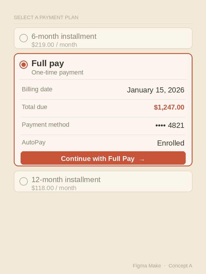
Selected-state expansion
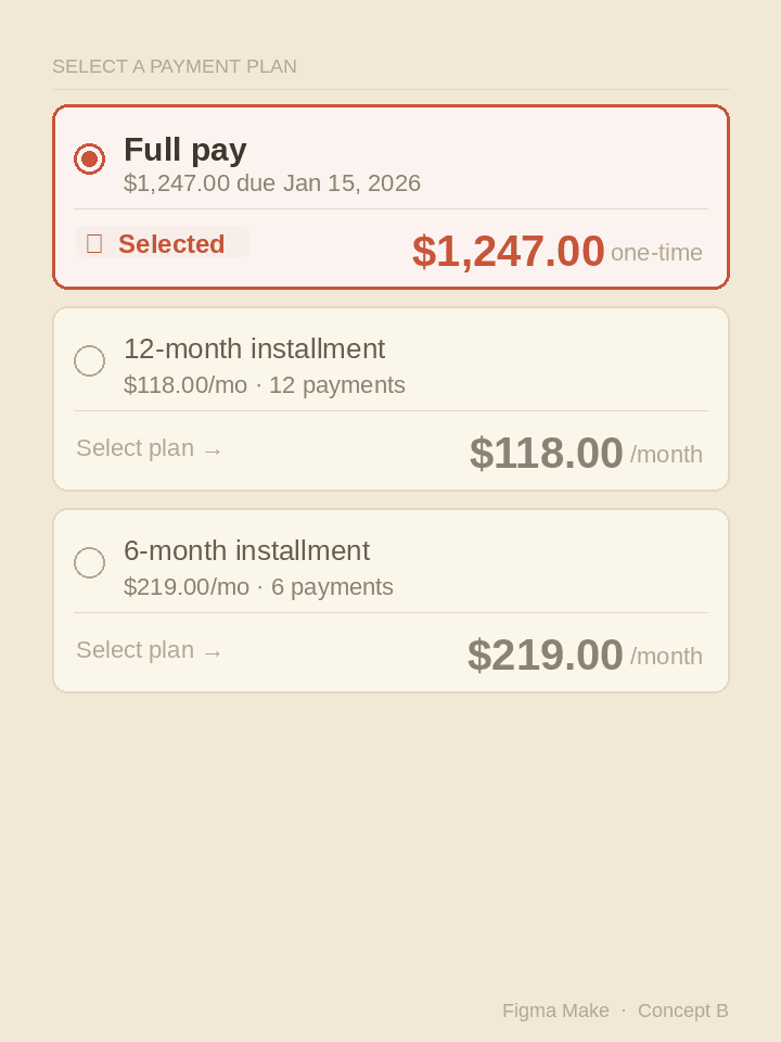
Inline metadata row
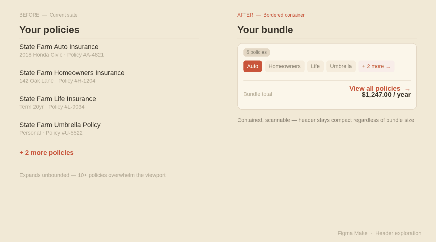
Bordered containers — grouping header content
A recurring theme across all three concept directions was the need to contain and bound content that currently spills unbounded through the checkout header. The policy list — which can grow to 10 or more line items for business customers — pushes the payment task out of view before the user even begins.
Using a bordered container to wrap the policy summary creates a predictable, bounded surface: the header stays compact regardless of bundle size, policies are scannable at a glance, and the primary task remains visible on load.
Bordered element with interaction link
My first solution explores a box-shaped container with icons for each policy type (auto, homeowner's) with a "Show all" inline expansion link in the container. This preserved visibility at a glance while managing edge cases, but still has challenges solving for business policies.

The product owner flagged a concern that this approach still competed for visual attention with the primary task — completing checkout — and requested a lower-emphasis treatment.
Text-based interaction link with drawer
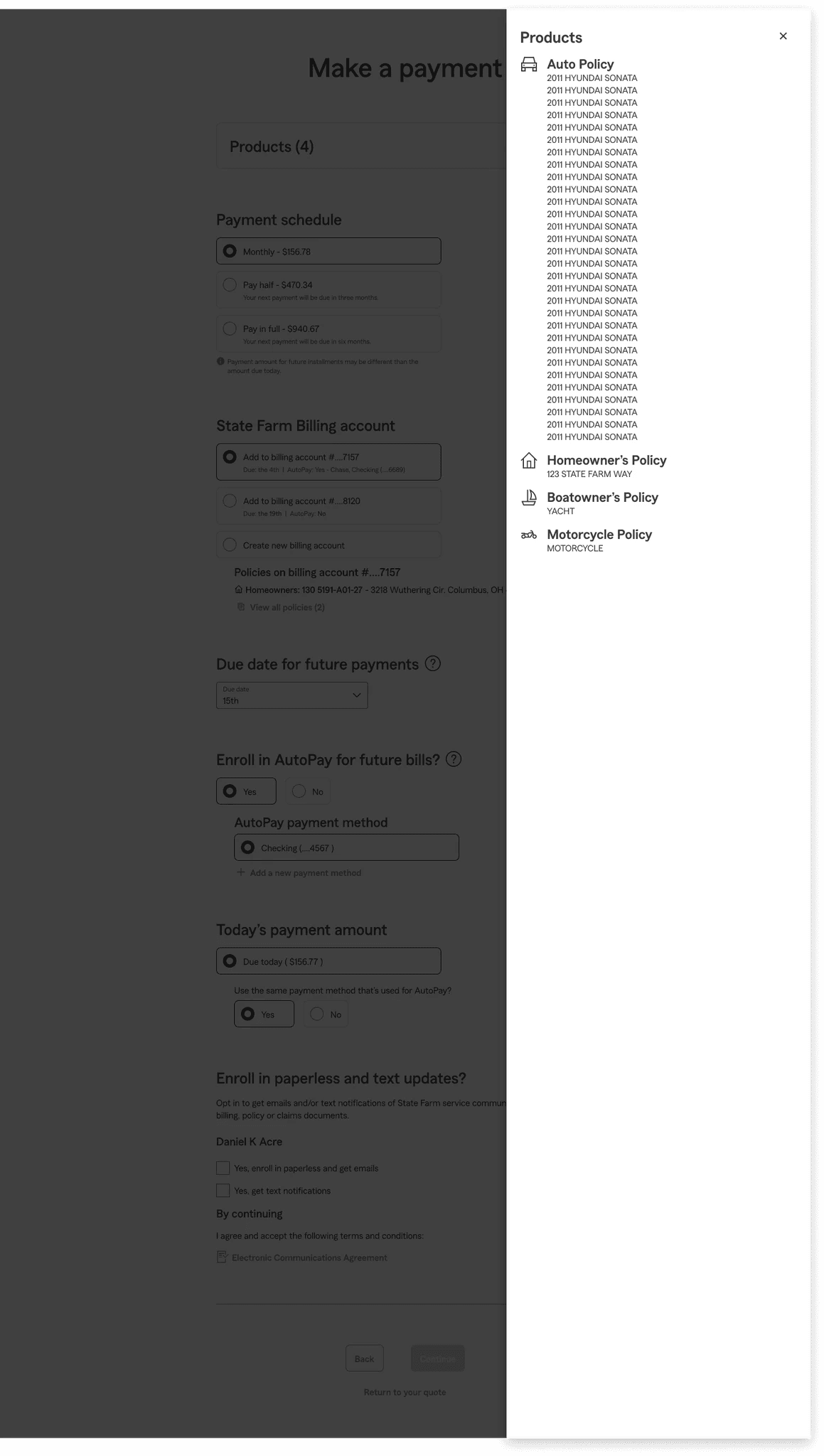
The final direction uses a single text-based "Products (4) →" interaction link that opens a side drawer. This keeps the header clean and task-focused while preserving full policy visibility on demand. The same drawer interaction pattern can be used consistently across multiple contexts in the checkout flow — payment methods, policy details — which builds interaction familiarity.

Policy drawer — reusing the pattern
The agent channels allows users the opportunity to navigate from their experience to a side drawer featuring additional policy details. This pattern is less disruptive within the flow, while offering the capability to review important details or complete tasks while potentially reduces context switching.
Improving touch targets — bordered radio groups
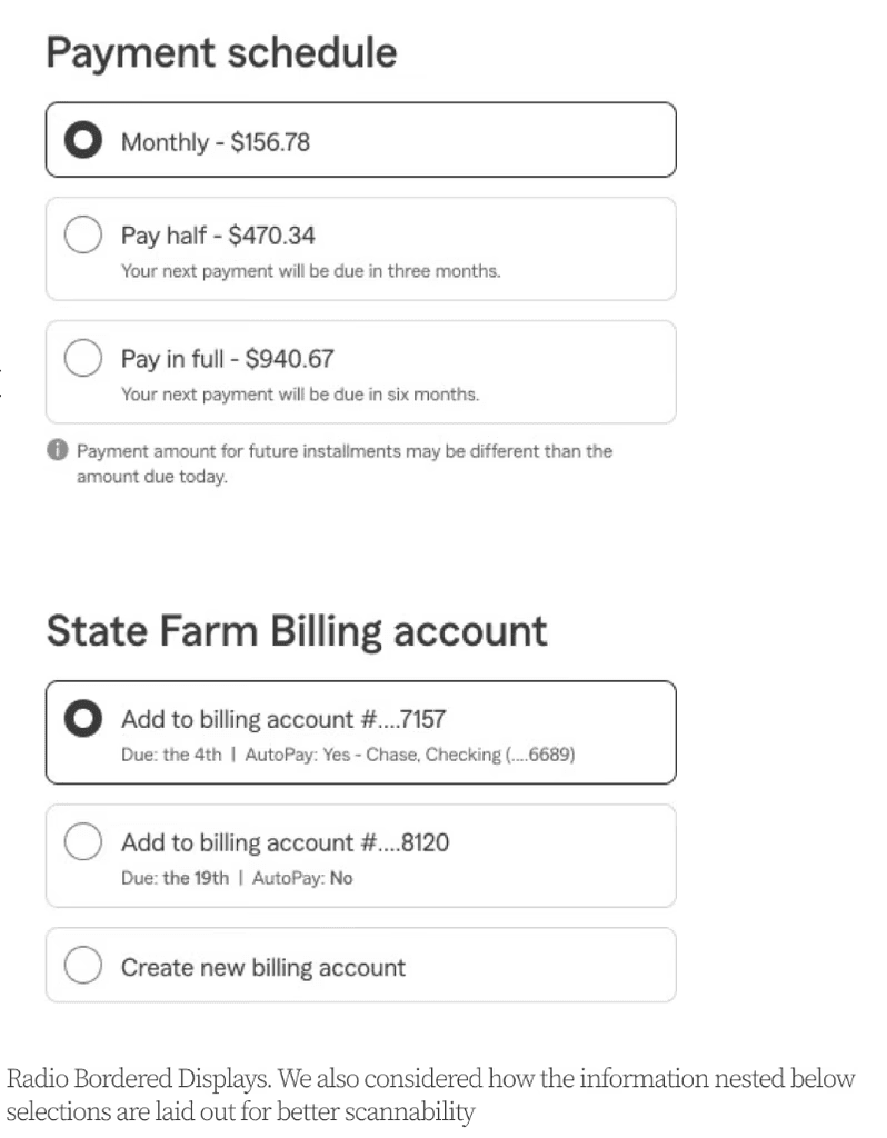
To address touch target density and information-dense selections (findings 2 and 3), I explored bordered radio groups from the existing design library. Standard radio buttons in the current experience are visually minimal and closely spaced — a layout pattern that works in low-density forms but breaks down when each option carries substantial nested information.
Bordered radio groups solve this by wrapping each option in a contained, tappable surface with sufficient padding. This increases the touch target size to meet accessibility minimums on mobile, creates a clear visual boundary between options, and allows nested information (payment schedule details, billing account metadata) to be grouped within each selection without creating the "wall of radio buttons" problem observed in the current state.
Payment methods — from inline expandables to a unified drawer
Adding a payment method (finding 5) was the most technically constrained design problem on the page. The existing approach uses two separate expandable links — "Add a bank account" and "Add a credit/debit card" — that expand inline through a third-party vendor integration, extending the page and fragmenting the form across different visual contexts.
The redesigned approach replaces both links with a single "Add payment method" interaction that opens a unified drawer. Inside the drawer, users toggle between bank account and credit/debit card via a segmented control, completing the full entry form within a contained surface before returning to the main checkout flow.
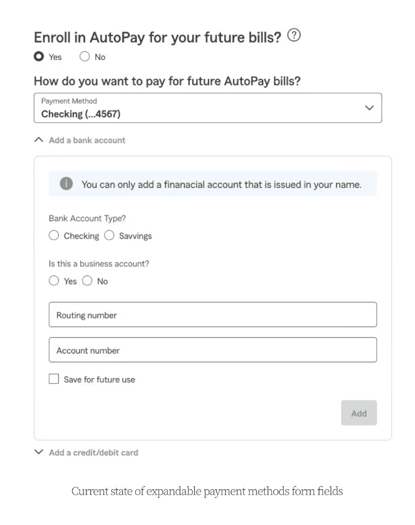
Inline expandables · current state
Two separate expansion links extend the page and fragment the form across different visual contexts.
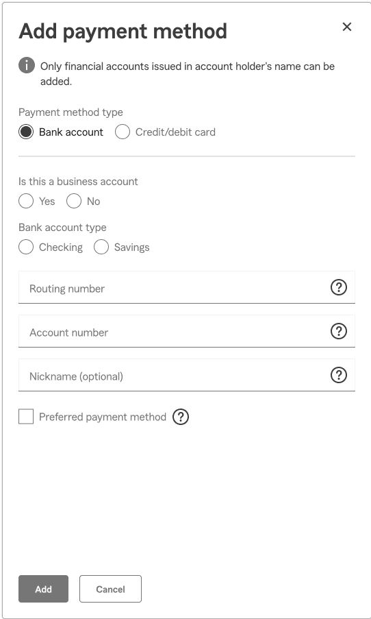
Unified drawer · redesigned
Single "Add payment method" opens a contained drawer with a segmented control toggling bank account vs. card.
Why this approach was selected
The drawer pattern consolidates what was previously a fragmented, page-lengthening interaction into a focused, bounded task. It reduces the visual complexity of the main checkout screen by removing two inline expandable sections, and it keeps users oriented within the checkout flow rather than losing context as the page extends. The component is also reusable across other billing and payment applications at State Farm, making it a high-leverage investment relative to its implementation cost.
Tradeoffs reviewed with the team
- Tidies real estate on the main checkout screen — two inline expandables collapse into a single, predictable interaction link.
- Consolidates bank account and credit/debit card entry into one bounded task, removing the fragmented "which link did I tap" moment.
- Leverages the same drawer pattern already introduced for products and policy details — one mental model across the flow.
- Reusable component across other billing and payment applications at State Farm; high leverage relative to implementation cost.
- Adds an extra step — users tap into a drawer rather than expanding inline. Acceptable given the gain in focus and reduced page length.
- Drawer-closure safeguarding: accidental dismissal mid-entry would lose progress. Mitigated with auto-save on field blur and a "discard changes?" confirmation on backdrop tap.
North Star — final design & recommendation
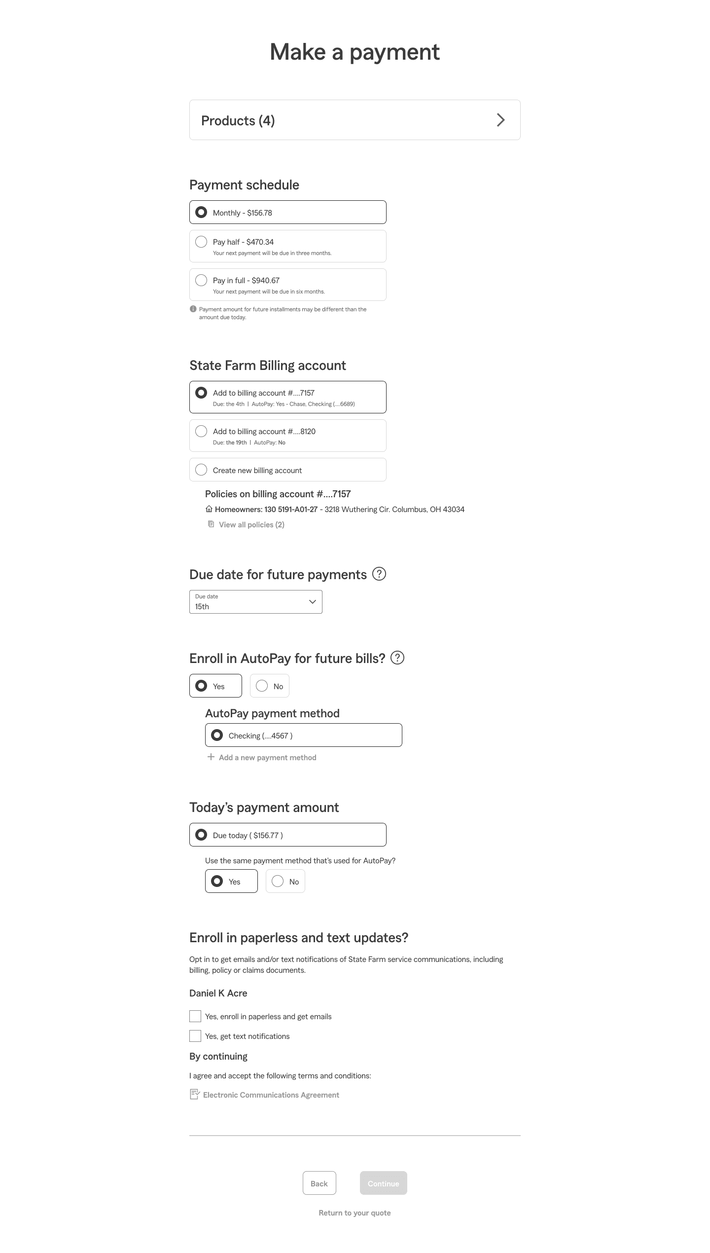
The consolidated checkout mockup represents the full set of design decisions applied together: the products text-link in the header, bordered radio groups for payment selection, the unified payment method drawer, and improved scannability through spacing and visual hierarchy.
Every pattern in this north-star view was designed to work for both audiences simultaneously — the progressive disclosure and drawer interactions that reduce cognitive load for customers also reduce the number of steps an agent must navigate to complete a transaction on a customer's behalf.
Hand off & delivery
§ 04
Phase hand off & delivery.
The work was scoped into two delivery phases to balance immediate impact against the broader Q4 2026 platform redesign. Phase 1 captured the highest-leverage, lowest-risk change — the payment methods drawer — and shipped through standard release channels. Phase 2 handed off the remaining concepts as documented direction for the platform team to absorb into the larger redesign, ensuring nothing was lost between the MVP work and the long-horizon effort.
- 01Shipped · Dec 2025
Payment methods drawer.
The unified "Add payment method" drawer was prioritized first — highest user-friction reduction, contained engineering scope, and a reusable component the platform team could absorb directly. Engineering partnered closely on the third-party vendor integration to keep the segmented control behavior consistent across bank account and credit/debit card entry.
Shipped to production in December 2025 with monitoring on funnel continuation and drawer abandonment. Documentation was written into the State Farm component library so other billing surfaces can adopt the same pattern without re-spec'ing.
- Final Figma specs
- Component-library entry
- Engineering handoff doc
- QA acceptance criteria
- Analytics instrumentation plan
- 02In progress · handed off
Remaining concepts — documented direction for Q4 2026.
The bordered radio groups, products drawer, and other touch-target improvements were packaged as documented direction and handed to the platform redesign team. Rather than ship them as point fixes that would conflict with the broader redesign, they were captured as design intent — with rationale, edge cases, and component specs — so the platform team can absorb them into the new system without re-litigating the decisions.
This phasing avoided two failure modes: shipping changes that would be undone six months later, and losing the work entirely in the transition between teams.
- Direction document
- Annotated specs
- Decision log
- Handoff review with platform leads
Outcome & what's next
§ 05
Outcome & what's next.
Early post-launch monitoring on the Phase 1 release shows a 6% lift in funnel continuation at the payment-methods step — the primary metric the team scoped for this work. The change is small enough to remain within noise on a single week, but the trend has held across the first month of release and is consistent with the directional read from the heuristics and survey work that motivated the project.
Funnel continuation at payment methods step
Phase 1 release · first month post-launch · directional, monitoring continues.
What we're watching.
- Primary metric
Funnel continuation rate
Step-level continuation through payment methods. Trending +6% in the first month; watching for sustained signal across a full quarter before calling it.
- Support signal
Agent call volume
Agent-channel calls categorized as "payment entry confusion" — a soft proxy for self-serve completion. Early read suggests modest decline; ops team confirming category mapping.
- Risk signal
Error & abandonment within drawer
Drawer-level abandonment, validation errors, and accidental-dismissal events. Watching closely given the tradeoff identified during design — auto-save and discard-confirmation are the primary mitigations.
- Phase 2
Baselines for handed-off concepts
Holding current-state metrics on bordered radio groups and products drawer so the platform team has a baseline to measure against when the Q4 2026 redesign ships.
Reflection.
The most valuable decision on this project was scoping the work into two phases. The temptation to ship everything at once was real — the heuristics review surfaced eight findings, all defensible, all addressable. But shipping all eight as point fixes would have created a maintenance and design-debt problem six months later when the platform redesign landed.
Choosing one focused, high-leverage change to ship and packaging the rest as documented direction kept the team honest about what was MVP versus what belonged in the larger redesign. The phasing decision was harder to make than the design decisions.