State Farm Customer Policy Change
Designing a self-service payment experience for customers adding a vehicle to an existing auto policy.
Problem & context
§ 01
Problem statement & context.
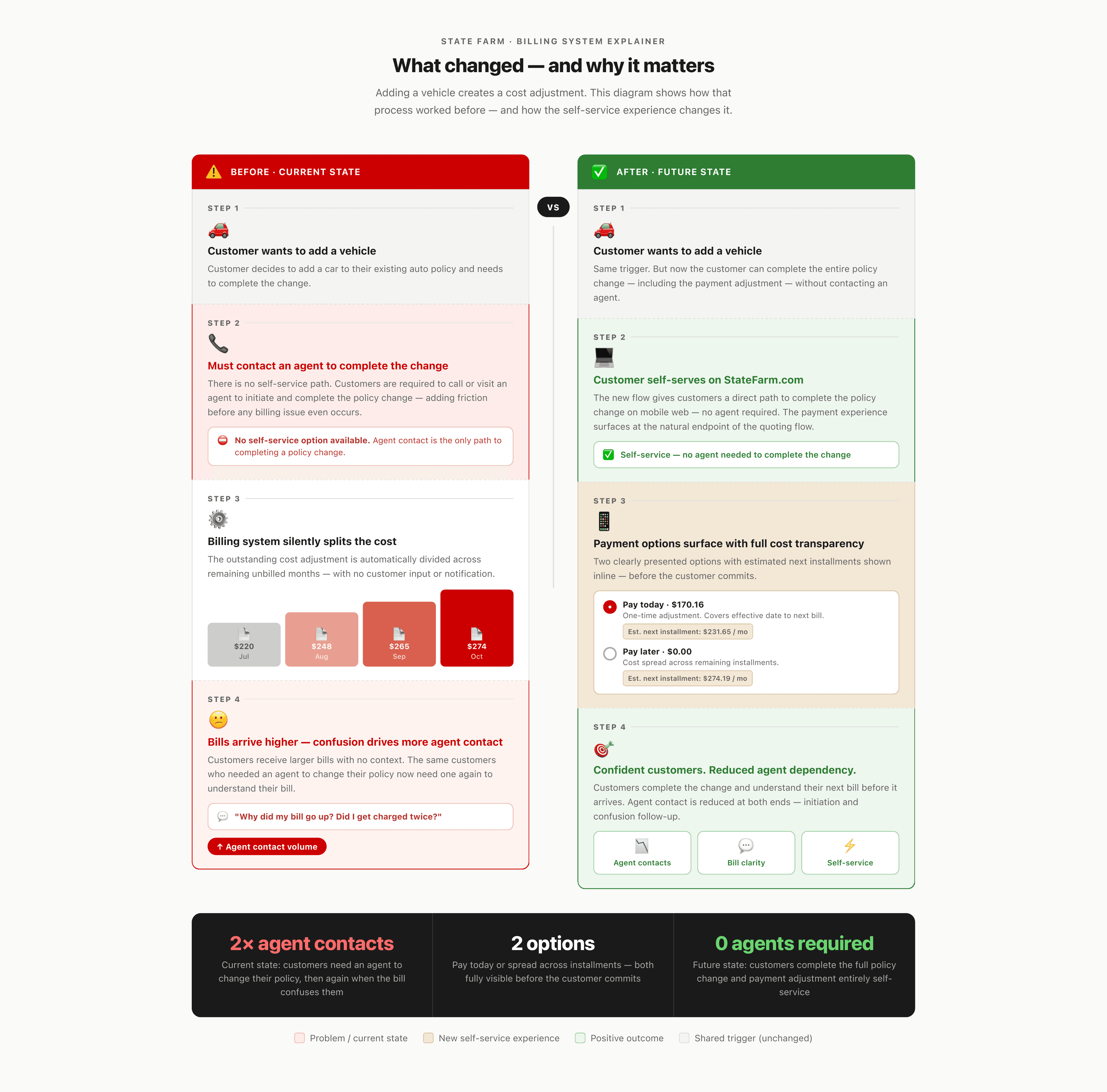
When customers attempts to make a policy change — like adding a vehicle — they first have to complete the process through an agent. State Farm's billing system then automatically splits the cost adjustment across remaining months, resulting in unexpectedly higher bills with no explanation. This erodes trust and drives unnecessary agent follow-up.
A new capability was introduced to let customers settle the cost difference upfront with a one-time payment. We were tasked with designing and testing the self-service experience for this experience on StateFarm.com mobile web.
Alignment & research
§ 02
Alignment & research.
After intake, the effort launched with a cross-functional kick-off meeting bringing together designers, product owners, and business partners. The session established a project timeline and aligned the team around the expected deliverables: iterative designs, an end-to-end interactive prototype, and static designs for multivariate testing.
Testing status
Moderated qualitative interviews and static comprehension testing are currently underway. A formal scope meeting with the Enterprise Research team is scheduled for late April to synthesize findings and determine whether design iterations are needed ahead of launch. Results will directly inform Phase 2.
Research Objectives were defined in partnership with Enterprise Research to ensure the work was grounded in measurable customer outcomes:
- Understand customer comprehension of payment options and billing impact.
- Identify pain points or confusion in workflow navigation.
- Assess clarity and effectiveness of content.
- Measure customer satisfaction with self-service experience.
- Determine customer confidence and feeling of being informed post-transaction.
- Evaluate impact of payment option choice on perception of value and trust.
Design process
§ 03
Design process & solutioning.
Initial exploration
I used Figma Make as part of early ideation, entering project requirements and journey context to generate initial layout explorations and pull component concepts. Each prompt iteration produced a different structural take on the same problem — surfacing two payment options, an installment table, and a CTA — which gave the team concrete options to react to in working sessions, far faster than I could have hand-sketched.
Journey mapping & cross-team collaboration
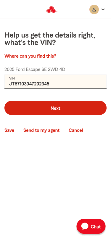
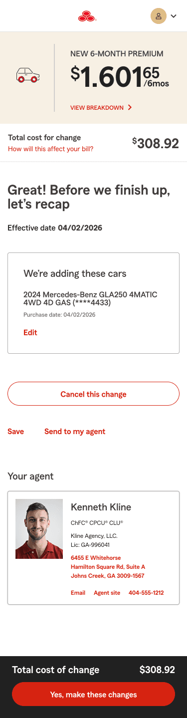
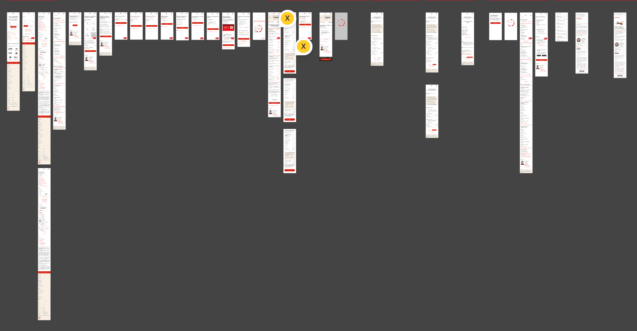
Before designing the payment screen itself, I collaborated with the Personal Auto Quoting team to document their existing user journey — specifically the last touchpoint before the handoff into the billing workflow. Mapping this current-state flow was essential: it established realistic customer expectations at the moment of arriving at the payment selection screen, and surfaced critical content alignment issues earlier on.
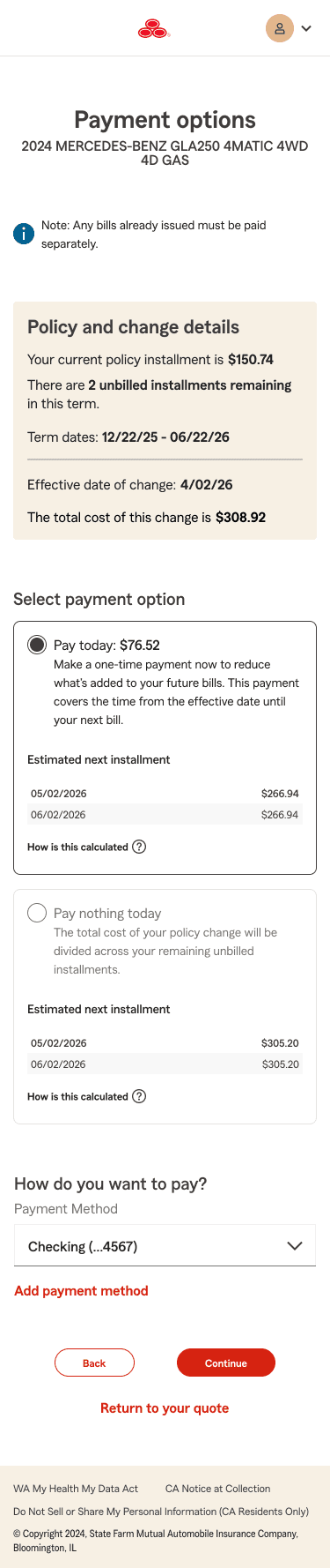
Working sessions & iteration — payment selection considerations
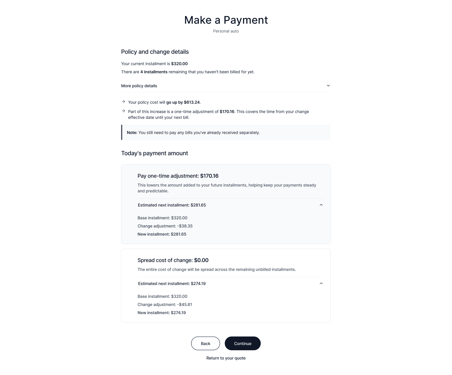
The design process was shaped through several rounds of collaborative working sessions with stakeholders and designers, improving upon the rapid set of AI wireframes. These sessions were used to evaluate technical proofing, layout options, component behavior, and content framing. In establishing a solid foundation for the requirements and anatomy of the experience, I compiled several displays to discuss in tandem.
Content layout & radio selection
The khaki container creates a clear visual boundary between the installment schedule and the payment option(s). Customers would be able to identify that these numbers are grouped as their current policy details. Color contrast on the khaki surface is also important — dark body text and avoiding red typographic elements.
Touch targets and progressive disclosure state management: Bordered radio buttons were the existing library pattern that highlighted interaction and defined mobile-touch targets. The primary concern was viewport constraints on mobile — with two selections visible simultaneously being critical to helping customers compare their options side-by-side. Losing one option below the fold risked customers not understanding there was a choice to make.
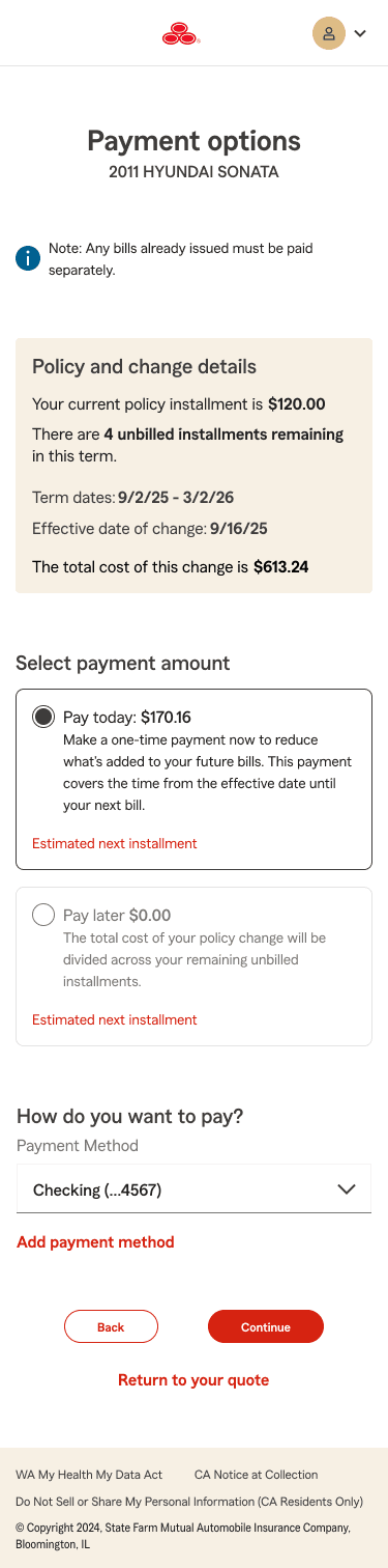
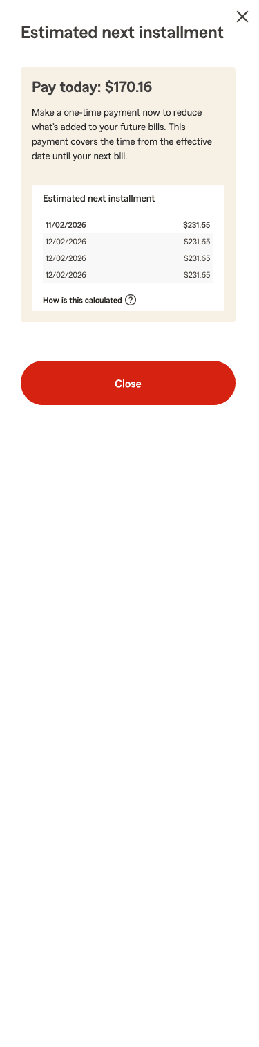


Installment UI — three variants for multivariate testing
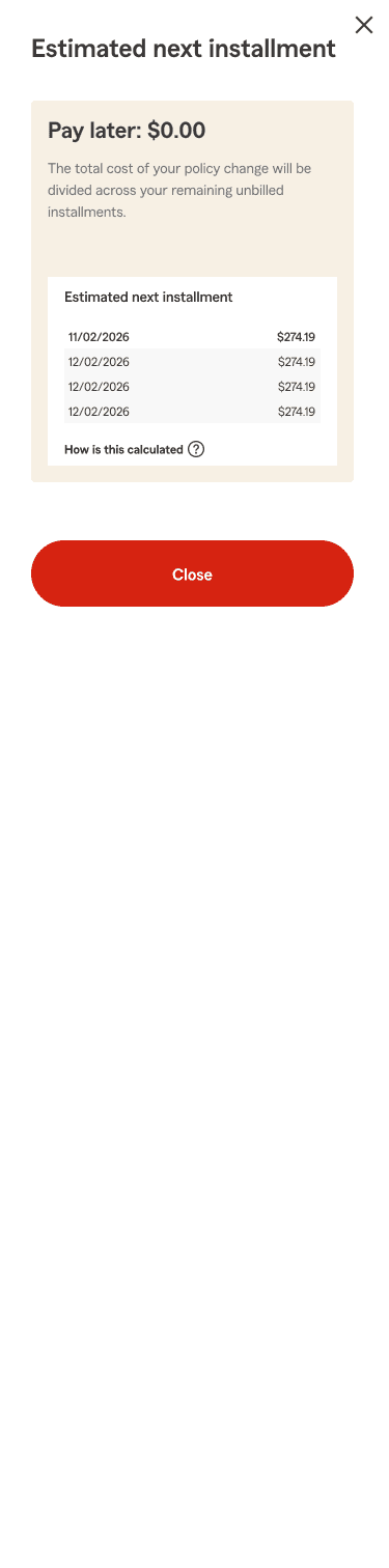
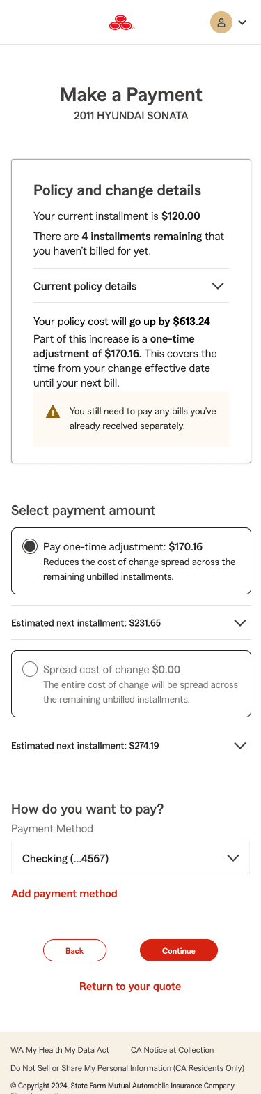
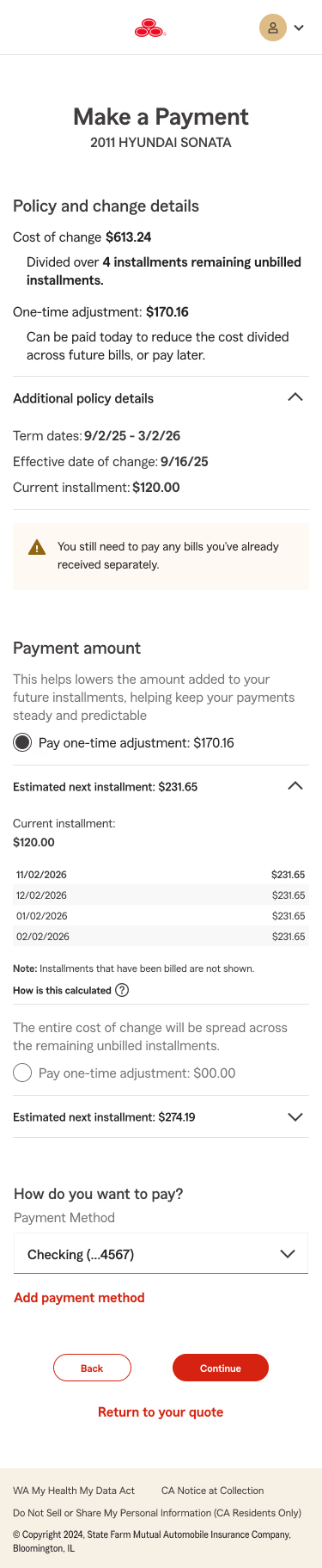
The installment table was the most debated element. We advocated between allowing full transparency on page load vs. nesting the table under other elements, saving real estate and having better visualizations of the two radio selections. While the relatively dense content was integral to the narrative of what customers would be opting into — there is a risk of information overload for the sake of clarity. As the initial phase of this effort is for data gathering, we wanted to allow customers full insight into current/future installment amounts across their premium.
Ultimately, we opted into three approaches to the installment table for multivariate testing.
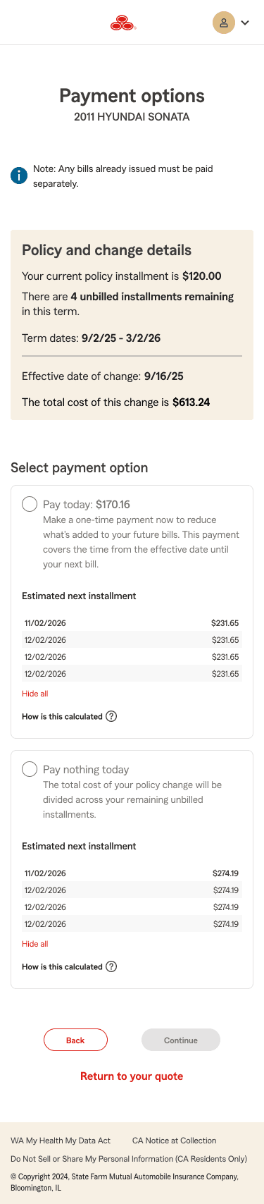
Inline table (baseline for prototype testing)
The installment table is displayed inline alongside the payment selection radio button, with a minimum of three rows shown on load and an inline link to expand additional rows. Selected as the baseline because the khaki-toned container provides visual grouping and constraint, differentiating from the table figures representing estimated next installments. It also surfaces the full cost-of-change impact with maximum transparency, even at the cost of additional screen real estate.
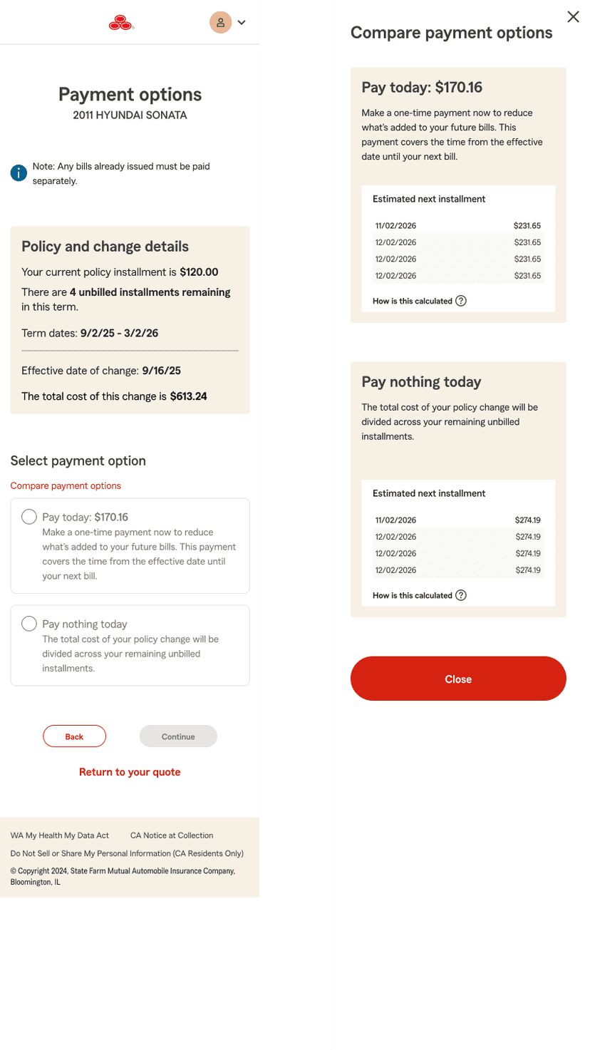
Drawer with side-by-side comparison
The installment table is hidden within a drawer. A "Compare payment options" link opens both tables in a side-by-side overlay, enabling direct comparison without cluttering the selection screen. Designed for customers who want to actively compare before deciding.
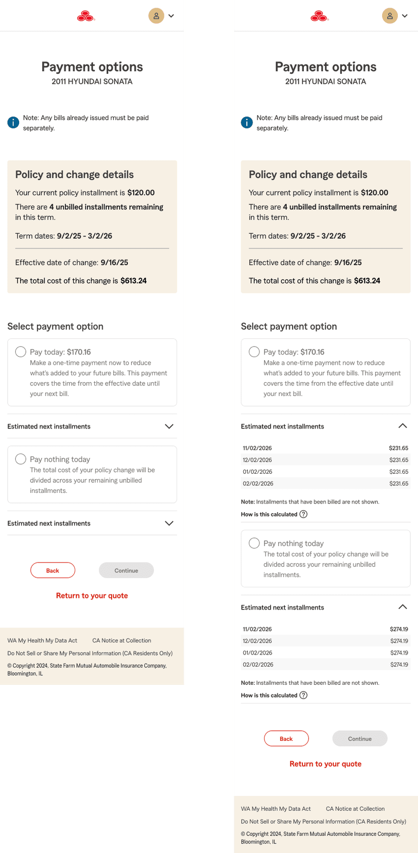
Collapsible accordion
The table is revealed only when the user expands it beneath each option. This kept the interface visually clean but raised discoverability concerns — customers who don't expand may miss key billing context entirely.
Customers needed to understand that the figures in the table represent what their future bills could look like — not an additional charge. By keeping the estimated next installment (ENI) fully visible on load, Version A prioritizes transparency over compactness. The team accepted the tradeoff of increased scroll depth in exchange for reducing the risk of customer confusion about what they were agreeing to pay.
Payment review
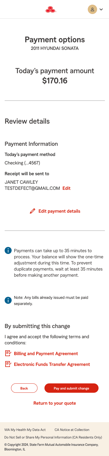
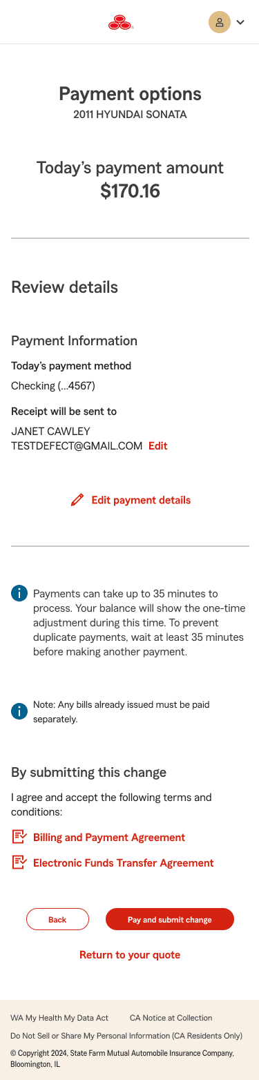
After customers make their selection, they transition to a review screen displaying the added vehicle, payment amount, payment method, and legal agreements. Because this screen reuses existing code from another product acquisition funnel, design considerations were more constrained. The primary focus here was legal compliance in informational alerts and a thorough content review to ensure all billing disclosures and disclaimers were accurate and complete.
Hand off
§ 04
Hand off.
Deliverables — the effort produced a complete set of handoff assets, including:
- End-to-end interactive Figma prototype spanning quoting to payment confirmation and communications
- Annotated design snapshot file with finalized components and screen states for development
- Static design assets for multivariate A/B/C testing across three payment option treatments
- Content-reviewed and approved copy for all payment-related screens and billing communications
What's next
§ 05
What's next & measuring success.
The MVP is currently in active development. This experience is both customer-facing and agent-facing — agents will use the same flow to help customers understand the cost of a policy change during service interactions.
Phase 1 verdict — late April
Research synthesis is scheduled for late April, with findings expected to inform whether Phase 1 designs hold or require iteration before full launch.
What we're tracking:
- Agent contact volume related to billing confusion following a policy change — the primary signal that the problem has been reduced
- Agent feedback on information hierarchy — specifically whether the payment option presentation helps agents convey cost-of-change clearly to customers
- Comprehension testing results from the Enterprise Research partnership — which variant customers best understand, and where confusion still exists
- Multivariate test outcomes — which of the three installment UI treatments produces the highest clarity and confidence at the lowest abandonment rate
Reflection.
This project reinforced how much of the real design work lives outside the design file. The decisions that shaped the final experience — payment option presentation, content framing, technical scoping, legal compliance — were made in working sessions, not in isolation. Designing for clarity in a constrained, multi-team system requires as much communication and relationship management as it does craft. The most impactful thing I did on this project wasn't any single screen — it was ensuring the right people were in the room when tradeoffs needed to be made.
Challenges
§ 06
Challenges.
Tight delivery timeline
The project carried a strict deadline requiring rapid iteration across design, content, and prototype fidelity simultaneously. The intake was received in March with an expected development start in May. Using Figma Make for early ideation helped compress the exploration phase — enabling the team to react to a broader set of concepts earlier — without sacrificing range or quality.
Cross-team content alignment
Initially, the page headers were "Make a Payment" which was the default treatment across our B&P payment selection experiences. The quoting team raised concerns that using "Make a Payment" as the primary header could negatively impact conversion rates from their flow. We also identified that legal disclaimers present in the billing flow were absent from the quoting team's screens — requiring cross-team coordination to resolve before launch.
Scope management & technical constraints
Several design asks were flagged by the product owner as out of scope for Phase 1, primarily due to the technical boundary between the quoting platform and the legacy billing service. Rather than allowing these constraints to block progress, they were documented clearly in the design file as future iteration opportunities.