NRG Electricity Checkout Research
Generate insights into customer product perception and checkout behavior in energy purchasing.
Problem & context
§ 01
Problem statement & context.
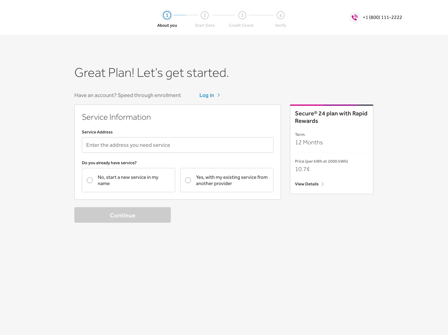
We received a request to conduct customer testing for a checkout funnel with an electric retail company under the NRG Energy portfolio. For the purpose of discovery and exploration, their team sought to utilize findings and inform pain points/desirable user features for a 2023 roadmap. These insights would be used to inform experience solutions for my team's brand — NRG Direct Energy.
Business need
Improve conversion rate on a customer acquisition funnel:
- Identify user pain points and reduce friction following shopping and while checking out.
- General insights into customer product perception and checkout behavior.
Alignment
§ 02
Alignment.
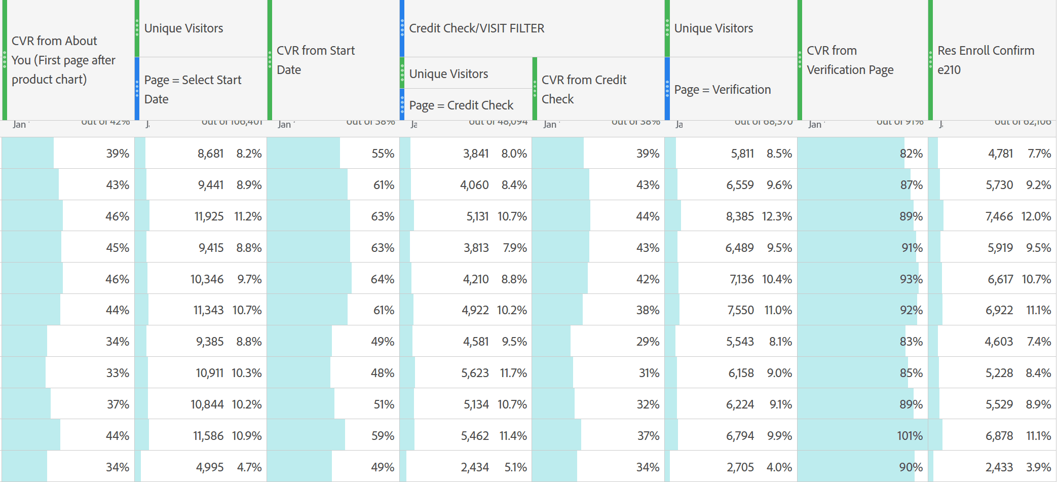
In the role as single test facilitator, I participated in a kick-off meeting to introduce myself to their respective product team consisting of: experience, product, marketing, and engineering. We did an extensive walk-through of the product flow and interactions. KPIs were gathered to inform current baselines. While I wanted to identify specific drop-points and user funnels in clicks, these data were not available due to analytical limitations.
Designers requested specific considerations for discovery:
- Desired user features
- Preferred communication methods
- Friction in payment processes and information security
- Editing information prior to enrollment
- Identity verification as pain point
- Brand perception
Methodology
§ 03
Guidelines for generative research and qualitative data collection.
Unmoderated Live Usability Sessions
10 participants shop for providers in a deregulated market (choice of energy provider is not regulated by local government). Sessions are recorded without moderation by the testing facilitator for unbiased and quicker insights.
Moderated Live Usability Sessions — deregulated
5 participants shop for providers in a deregulated market. Sessions are recorded, but facilitated through interactive research questions by myself.
Moderated Live Usability Sessions — regulated
5 participants shop for providers in a regulated market. Sessions are recorded, and facilitated to learn about users unfamiliar with the process to gather their thoughts.
Screener Criteria
18+ and primary energy decision-maker for household, U.S. residences, currently associated or is enrolled with a specific provider (deregulated users).
Runtime, Recruitment, and Facilitation
First sample set ran for 2 weeks with an additional 2 weeks for thematic grouping, data interpretation, insight generation, and documentation. Participants were recruited through UserTesting and live sessions occur via Zoom.
Sessions average between 30 – 45 minutes.
Testing Goals and Task Framework
To frame these research goals, we defined the primary user objective as: verify personal information and complete enrollment in an energy plan. We then identified and decomposed the steps required to achieve this objective into discrete tasks, enabling us to observe user behaviors, success criteria, pain points, and mental models at each stage.
To complete enrollment, participants needed to work through the following tasks:
- Review the selected energy plan
- Confirm residential address
- Provide personal information
- Verify identity
- Set plan and communication preferences
- Select an available service start date
- Set up payment information
- Review previous inputs for accuracy
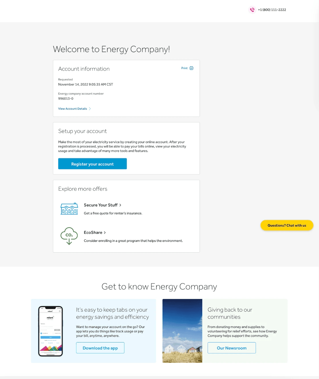
- Confirm and complete enrollment
Research Scenario and Testing Script
Both moderated and unmoderated participants were introduced to the prototype with the following scenario. The scenario was designed to provide context and reflect real-world mental models that users bring to an energy plan shopping experience.
You have been shopping for an energy plan for your household. Having decided on a preferred plan, you're now proceeding through the checkout process. This includes verifying your personal information, choosing plan preferences, selecting a start date, and setting up your payment method before reviewing and enrolling in your plan. Please continue through the prototype and share your thought process as you navigate this experience.
Post-Task and Reflective Questions
- Was any part of the process confusing or frustrating? Why?
- Which part of the process felt easy or satisfying?
- If you could change one thing about the overall process, what would it be?
- What are your impressions of the "Payment Setup" section?
- How confident did you feel about the information you provided?
- Were there any steps where you hesitated or felt unsure about what to do next?
Prototype
In parallel with writing the research guidelines, I developed a testing prototype from a set of existing wireframes. The prototype was reviewed by the product team to ensure it replicated the live environment.
Interpretations & analysis
§ 04
Interpretations & data analysis.
Once all of the transcripts were made available, they were reviewed several times contrasting with moderated notes for cross-analysis to uncover high level themes.
Qualitative Demographics & Sample Size
- 19 total interviews, 1 appointment missed. 15 total from deregulated energy market.
- Age group: 19 to 52. Median: 32.
- State groups: Texas (15), New York, Florida, Oklahoma, Colorado.
Quantitative Analysis
- Avg time of completion: 2–11 minute range; 4 mins average
- 94% (18/19) participants clicked primary interactions as intended: Blue CTA to proceed, self-populating inputs, calendar clicks, selecting highlighted start date, radio clicks, completing enrollment
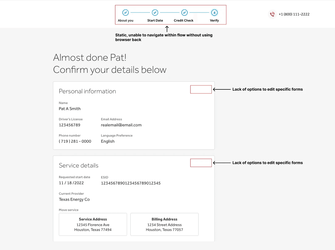
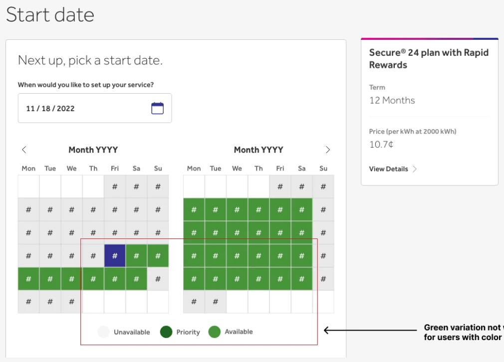
- Notable misclicks: 21% attempted to click static calendar icon expecting an interaction; 26% clicked steppers anticipating navigation; 10% clicked between every calendar marker, unable to distinguish between start dates
Thematic Analysis and Interpretation
- Segments of text that aligned with research goals or user tasks were pulled and coded
- Develop descriptive codes from grouped text
- Explore causal relationships, contrasts, or contradictions between codes to uncover underlying themes
- Evaluate themes based on instance, saturation, and supporting evidence
- 01
Streamlined and familiar journey
- 02
Users value control, flexibility, and transparency
- 03
Content can support — or undermine — enrollment
- 04
Visual cues shape decision-making
Themes & insights
§ 05
Themes & insights.
Four core themes emerged that shaped how users understood, navigated, and ultimately trusted the enrollment experience.
A streamlined and familiar journey
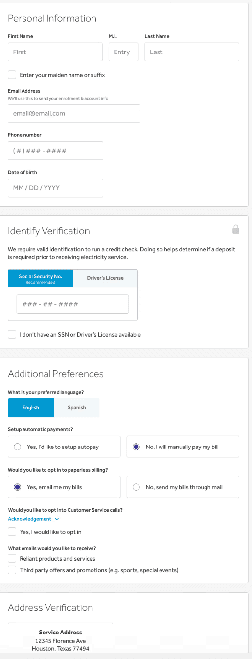
Across the study, users consistently described the enrollment flow as simple, intuitive, and aligned with what they expected from similar online experiences.
- 89% (17/19) found the end-to-end process easy or very easy.
- Participants compared the flow to familiar retail or service checkouts like Verizon, AT&T, and Ikea.
- Inputs matched what users anticipated — minimal, straightforward, and spread across only four pages.
- One user experienced moderate difficulty tied to the start-date calendar interaction; one chose not to complete the flow.
- Overall, users saw the experience as clean and approachable.
Users value control, flexibility, and transparency
Users voiced a strong desire to stay in control of their information and decisions throughout the journey.
Control & Flexibility
- Many wanted the ability to edit details, especially from the review page.
- 33% (3/9) requested inline editing links on the verification page.
- Stepper inconsistencies caused confusion for 33% (3/9), leading to questions like, "Do I have to manually click back?"
Communication Preferences
- 88% (8/9) preferred opt-in over default marketing communications.
- 66% (6/9) wanted more communication options, with 55% preferring text.
- Users only wanted alerts for essential items: payment due dates, confirmations, and outages.
Payment & Identity Transparency
- 44% (4/9) wanted additional payment methods beyond bank draft (PayPal, Venmo, Apple Pay, etc.).
- 22% (2/9) were uncertain whether credit checks were hard or soft, and where they occurred.
"When did I sign up for surge protection? Am I being charged for this?"
Contextual Challenges
- 50% of regulated and 26% of deregulated participants described shopping for electricity as overwhelming.
- Several noted inconsistent pricing, jargon, or unclear plan differences as major pain points.
Content strategy can support — or undermine — enrollment
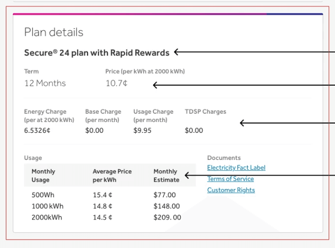
Participants made it clear that correct information and placement directly affects confidence in enrolling. Users frequently described having multiple tabs open while shopping for energy plans. Clear, persuasive content served as reassurance they were making the right choice.
They recommended:
- A dedicated page to review the selected plan in detail
- Price comparisons or clearer cost breakdowns
- Reinforcing key benefits of the chosen plan
- Competitor comparisons during verification, supporting the moment of commitment.
Visual cues shape decision-making
Visual design played a large role in users' trust and ability to move through the flow:
- 52% (11/19) wanted clearer branding, bolder colors, or more visually engaging layouts.
- Many referenced the need for: consistent brand colors, stronger hierarchy in entry fields, more distinctive typography, anchored customer support info.
Micro-interactions noted
- Users requested tooltips to define jargon (e.g., kWh, payment terms).
- Color-coding on the calendar caused confusion, especially for accessibility considerations.
"If I was color blind, how would I know the difference? Both options are green."
Calendar modal trigger
- The calendar icon — designed as a modal trigger — confused multiple participants.
"I would've quit right here if the calendar didn't pop up."
Hand off & outcomes
§ 06
Hand off & outcomes.
The usability study of the Checkout experience provided meaningful qualitative insights, actionable evidence, and a deeper understanding of user expectations across both energy brands. While participants responded positively to the streamlined journey, the research surfaced several opportunities for refinement — ranging from clarity and transparency to visual hierarchy and micro-interactions.
What's Next
- Partner with product to translate insights into practical design recommendations, technical considerations, and implementation paths
- Testing design solutions and edge cases with known drop-off points
- A/B testing across brands to understand performance differences
- Deeper exploration into comparison behaviors and content clarity needs
- Workflow Improvement — streamline the research process to ensure consistency across future studies, including clearer participant guidelines and improved prototype responsiveness.
- Concept Testing — evaluate new UI concepts — branding, color, interaction patterns, and unique visual cues — while ensuring alignment with the existing design and accessibility standards.
Challenges & Reflection
Testing Environments
Differences between controlled (moderated) and uncontrolled (unmoderated) sessions influenced response consistency.
Prototype Fidelity
The prototype did not fully mirror live system behavior, which affected how users interacted with certain components (e.g., the calendar modal).
Question Structure
More tailored question sets or guided prompts — possibly using platforms like UserTesting — could have produced richer, more consistent feedback.
Role Constraints
Managing research, facilitation, analysis, and coordination end-to-end highlighted opportunities for cross-functional support in future cycles.